How to Create Your Own Color Combinations
But what if you’re not starting from scratch and you just want to know ‘what colors go with what?’ Maybe you have a pink chair in your bedroom that you love or a pale green sofa in your living room. What wall colors go best and what accessories can you add that will match?
This is where you can add a tool to your designing toolbox. It’s called the color wheel and it can tell you what colors go together based on their relationship to each other on the wheel. So this post is all about what the color wheel is and how to use it.
First, there are a couple of basic things we should review about color.
Your Preferences
It’s always best to focus on colors you like, regardless of the latest trends.
What colors do you most like to wear? Which colors do you gravitate towards? Which do you almost always reject? Don’t hesitate to experiment, but if you don’t like a combination don’t force yourself to go with it. You’re going to be looking at it every day.
The Psychological Effect of Color
Certain colors have the power to evoke emotion or influence a mood. Marketers & interior designers have known this for a long time.
Bright colors in general are more energizing and softer colors more calming.
If you are looking for a calming color in the blue family, you would look for a soft color blue, not a dramatic blue which would be more energizing. A soft, buttery yellow color feels very soothing but a bright taxi-cab yellow is anything but.
So, it’s not just the colors themselves but the different hues and shades within the colors that influence a mood. When you think colors, you want to consider the purpose of the room or area you’re painting.
- If you’re painting a bedroom, you may want more calming or soothing colors.
- Energizing colors are often good colors in a kitchen. I have red as an accent color in my fairly neutral kitchen.
- Looking to make a statement? Choose a bold color.
There’s lots more info out there on the effect of color but for now just be aware of the area you’re painting. If you’d like more info on the subject, though click here for a good article by Decoist.
Other Considerations
Texture
Texture adds depth and interest to a space. Contrasting textures can be used to add contrast, even when the color is the same.
Light
Light can refer to natural or man-made sources. Without light other elements like color and texture don’t exist. Light sets the mood. Subdued lighting gives a room a cozy feel. Rooms filled with natural light feel airy. Whatever mood you are trying to create in a room with color, it’s good to understand that the lighting you choose or that is naturally there also plays a part.
Pattern
Patterns work hand-in-hand with color. They can be any shape and are created by using repetitive designs. Like texture, patterns add interest and life to a room so they are always something to consider using as you plan out your rooms. Now, back to that wheel…
THE Color WHEEL
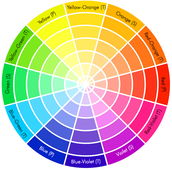
The color wheel is made up of 12 colors, and the relationship of each color on the wheel to other colors dictates how to coordinate them. From this point on I’m going to review the colors and their categories, what colors are warm vs cool and how you can pick colors that go together well.
The 12 Colors
Here are the colors and how they are categorized.
3 Primary Colors
Red, Blue, Yellow

These colors are pure, meaning you can’t create them from other colors, and all other colors are created from them.
3 Secondary Colors
Orange, Green, Violet

These colors are formed when equal parts of 2 primary colors are combined. For instance, Yellow+Red=Orange
6 Tertiary Colors
Red-Violet, Blue-Violet, Blue-Green, Yellow-Green, Yellow-Orange, Red-Orange

These colors are formed by mixing a primary color with a secondary color next to it on the wheel. For instance, Blue+Violet=Blue-Violet
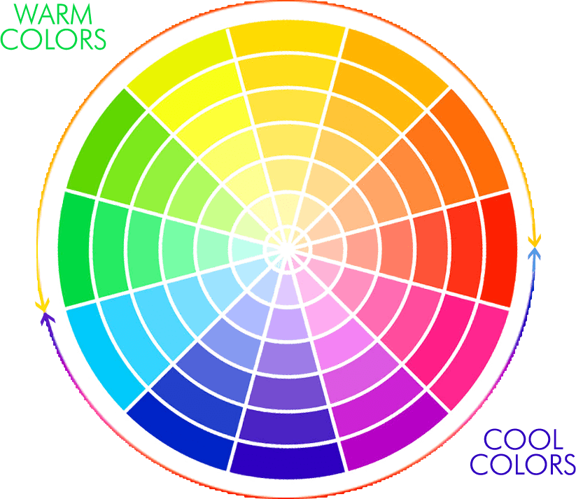
Cool vs Warm Colors
Each color is either ‘warm’ or ‘cool’ and that can be a consideration when you’re putting colors together. Here’s how to know what’s what:
Color SCHEMES
A color ‘scheme’ is a way to combine colors on the wheel. There are really 6 of them, but of those, 4 are the simplest and easiest to understand & use (my opinion!). When I describe them to you you’ll probably have a head-slap moment and realize why the colors you already like to put together work as well as they do.
Monochromatic
This scheme consists of 1 or more shades of the same color. Technically, it consists of ‘a single color that is either pure or mixed with white, gray or black.’
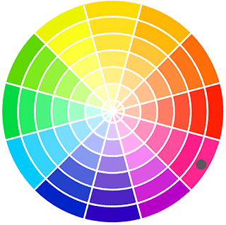
Monochromatic example on the color wheel (notice the dot on the single color)
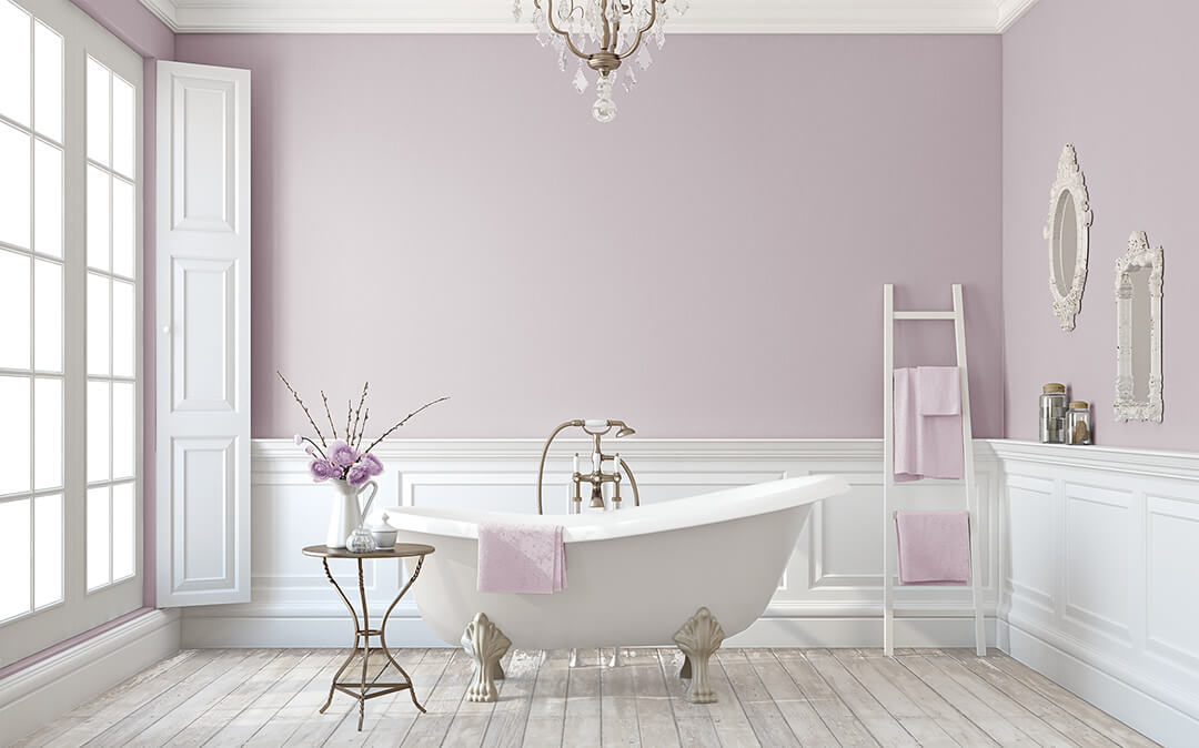
Monochromatic example in practice (the white and grey are neutral colors and don’t ‘count’
Complimentary
For this scheme, pick 2 opposite colors on the color wheel.
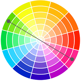
Complimentary example on the color wheel
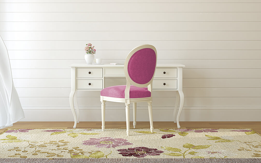 Complimentary example in practice (the pink and green are complimentary, the white is neutral and doesn’t ‘count.’
Split Complimentary
For this scheme, take a color and then add 2 neighbors of its (opposite) complimentary color.
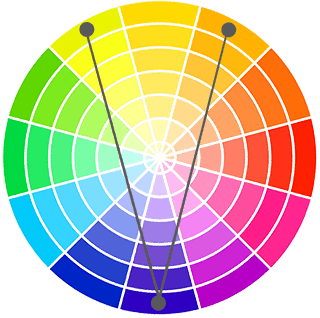
Split Complimentary example on the color wheel
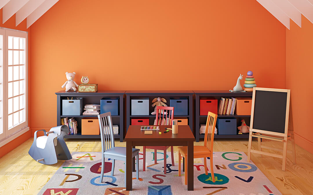
Split Complimentary example in practice
Analogous
For this scheme, use 2-3 adjacent colors on the wheel.

Analagous example on the color wheel
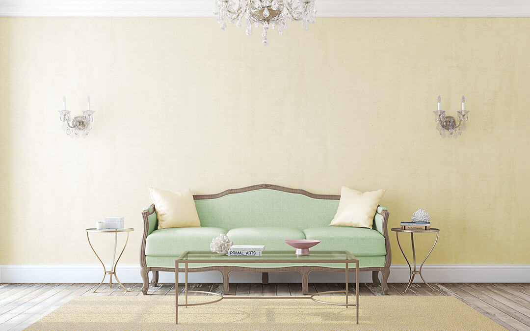
Analogous example in practice
What about Neutrals?
Summary
These all sound suspiciously like rules but, like everything in design, they aren’t hard and fast. Most of the time, I check out the ‘rules,’ decide if I like them and then add my own spin, if necessary. In the immortal words of Picasso, “Learn the rules like a pro so you can break them like an artist.”
Now that you know these rules, they just give you one more tool in your box and will free you up to release all that inner creativity.
How about you?
Got a good color story? Do you have an example that you love or a challenge that’s stumping you? I’d love to hear about it. Please share in the comments below!
